Thursday 31 January 2013

Thats a Wrap!

make a gif picture

After months of researching, planning, producing and blogging. I have finally completely everything! It's been a really enjoyable experience and I have learned a lot a long the way. A stand out part of the course for me was filming the music video and seeing it on the big screen. Although it has been a lot of fun, it was also a challenging experience and stress came with it all but nonetheless  it's been such a good few months of hard work and commitment but the blogging ends here! A massive thank you to all the teachers and of course, my group 2 members! A round of applause!


Final Progress Review


*110 individual blog posts

IT'S ALL OVER!


I have finally completed all my blogging task for the year! No more BLOGGING! Coursework this year has been very stressful with having to meet deadlines. However, it has been a learning curve and I have enjoyed myself massively! My favourite part of this part of the unit was definitely filming the music video! It was very exciting and challenging at the same time! Overall, I have enjoyed (almost) every part of this unit! I can finally say: I AM FINISHED!! 

P.S. Please excuse my poor image editing skills. 


Evaluation - Question 3 Part 2 (Animatics)


Evaluation - Question 2


Separate presentation for more Visual Links:


Evaluation - Question 1


Here are some example videos of what parts my group and incorporated in our music video, we made it as creative as possible by changing how we would use the certain scenes.

KANYE WEST- ALL OF THE LIGHTS


In this short clip, my group and I liked the idea of light and colours and the way it was flashing around the artist also the fast jump shots. We tried to incorporate this in the most creative way possible, we did struggle with getting the flash lights in various colours but only found a range of two colours. When looking back at our music video, we created this scene differently by having one light flashing in the back ground and a red laser flashing around the artist.


LEONA LEWIS- COLLIDE

Again in his short clip, it evidently shows the continuous back and forth motion of the 360 degree camera turn of the sky then back to the individuals in the sea. In our music video we had taken the idea of the 360 degree turn of the sky and used this in our video of our various locations, which was an indication of change in location and the change from day to night.


Final Progress Review Blog

Evaluation - Question 4 Part 2


Evaluation - Question 4 Part 2


Evaluation - Question 4 Part 3

(Due to issues with uploading a combined video, I have uploaded each feedback separately)
Here are some of the feedback we got from the audience after the cinema screening of our music videos. All the people we asked were part of our core target audience ranging from 18-24. 


Friday 25 January 2013

Production Ancillary - Thoughts and Opinions

I asked a few people what they noticed or liked most about my ancillary products and this is the feedback I received. I put the initial reactions into world as people picked things out that they particularly liked or something that they immediately noticed. A lot of people said that they liked the choice of images and felt that it was suitable for the style of the music/album and genre. Something that I did not put into wordle but was mentioned was the way I edited the images, a few people said that it added a "roughness" to it and as I previously mentioned, I wanted to add the grain texture to great a gritty urban edge so I think that was successful. Less people noticed the font because the images were most captivating which I think is great because it promotes the artist. However, people did mention that they liked the font used for the artists name because it really stood out. A few people also spoke about the colour, theme and style of the product. They mentioned that it all ties in very well and it matches the music video. A lot of people also noticed where we got the neon green from (the artists bomber jacket) which they all thought was very "clever". 

Things that they mentioned I could have improved on was maybe incorporating the neon green into the digipak a bit more or added darker colours and also someone mentioned that I could have used the grain background on every panel. This was interesting because I was actually planning on doing that with each panel but as I was editing, new ideas came to mind and I experimented. But overall, I think the feedback has been really positive. 

Product Ancillary - Finished Advertisement


Monday 21 January 2013

Production Ancillary - Influences and Links


This is Katy Perry's music video for her single "California Gurls". The outfit, scenery and props in the music video are also illustrated in the digipak and advertisement. This shows the clear link between both of her main and ancillary product. I think this is effective as the audience will be familiar with what the advertisement is for, or will recognize the advertisement and then would want to see the video. I think that if both products were too different, the target audience would be very mislead. 

 As inspired by Katy Perry's link between music video and ancillary products. We did the same with our choice of clothes and repeated it onto the images for the ancillary products. It's great for our products especially because of the neon green that stands out particularly well and will grab the audiences attention.

Production Ancillary - Influences

gif make
The images and style for my ancillary products were influenced by the American rapper known as A$AP Rocky. I chose him as inspiration because he's target audience is very similar to our core target audience varying from 16-24. I think that his style gets him recognized and I thought it would be a great idea to incorporate some of his style into our artist. 

Ancillary - Final work!

During the time of making my ancillary, i learnt many things about how creative i can be! Photoshop is definitely a good and reliable to use, although i did lose my work i ended up re-doing it and making it even better than it was originally.

Final Outside panel:


Final Inside panel:


Final Advert:


Thursday 17 January 2013

Production - Ancillary Products - Last day of editing


This is the final piece of my inside and outside cover of my digipak and the advertisement. I have made some changes to the last time that I had edited these. As I started the advert I realised that cropping the images and putting it on a black background was much more effective and professional. So therefore, I did this for all of the images used in my digipak. Also, using the luminous green on my advert meant that I had to create a visual link between the two pieces so I decided to add a luminous green glow onto my images on the inside panels of my digipak. This also made the digipak more appealing and interesting. In addition, I changed the colour of the album name on album cover to the luminous green to create a visual link and to add emphasis to it so that it is more visible to our target audience.

Wednesday 16 January 2013

Production - Ancillary Advertisement

After staying up most of my night due to deletion of my work, I completed my 3 panel digipack and advertisement again, changing my original ideas and making a new and improved one.


Production - Ancillary Outside panels


These are my inside panels, again still indecisive to keep it simple or creative, i guess I'll go with creative as it again adds to the theme of overloading etc. Im not too confident on the front cover picture

Production - Ancillary Inside panels


These are both my inside panels. The first one was my original idea, but i have come to a conclusion I should make an effort with detail, so i expressed the dependant word used in this work 'OVERLOAD' I feel this makes my work more creative but i am still experimenting with 'explosion' pictures to give an indication of something overloaded. Another picture I chose was an actual explosion.


Production - Ancillary progress work

Over the recent break my ideas for the digipack had changed. I made various changes, like the use of photos, a few editing aspects and change of theme. here are some screen shots:


During this change i also had a few moments where i couldn't think of anything to do, so i struggled to a point where I deleted my work and started again.

It was challenging but i got through it. I am now currently making a mood board of behind the scene and extra photos to mash together to put on my last panel, with also a mash up of other images in the background of the picture to express the original album name 'OVERLOAD' this again will be challenging but i have a few techniques i have learnt from Photoshop.

Production - Ancillary Screen shots


I have been working on my digipack for quite sometime and have original ideas that are shown in my work

As you can see I have decided to do a 3 panel digipack, these screen shots are my original piece of work that I have decided to do.

Planning Ancillary Products- Shortlist of photos


Some photos I have chosen to be in my ancillary work

Monday 14 January 2013

Production - Ancillary Products - Advertisement


This shows the progression of making my advertisement for my digipack. I have included all the information required on my advert including the artists and album name, the release date, reviews, contact information such as websites including social networking sites and most importantly an image of the album cover. I have manipulated the images on here by using the magic tool to cut the image of just James and then filled the back ground black. Also, I have added a glow to the 'out now' and the image of the album cover to add emphasis. I incorporated the luminous green on there for some of the writing as this creates a direct link with the artists. I got the colour from the green stripe of James' jacket which is a signature piece of clothing in the costumer aspect of mise en scene. 

However, after creating the advert I have realised that there are some things that I may have to alter on my digipak such the using the luminous green on some of the writing in the digipak to create a visual link and also the back ground of the images that I have chosen to use show the curtains so as a result I might cut the image out and just fill the back ground black as I did with my advert. 

All that needs to be done on my advert is placing the logos and texts in the correct places so that it is presented tidily.

Production - Ancillary Products - Inside Panels


These are some screen shots taken whilst producing my inside panels. With the inside panels, I wanted to create a visual link with these images and the music video by the use of light and dark. I wanted to reflect the transition from day light to night in our music video here by manipulating the brightness and contrast of the images used in the inside panels. I have made the image on the left bright to reflect the day time shots in the video and then I have manipulated the image on the right so that it reflects the night shots.

In addition, I filled the middle panel with the word 'Overload' and I decided to show the theme of light and dark again with the colour of the writing. I ended up using a white background for the middle panel instead of black as the middle panel on the outside panels is also white. Then I chose a light shade of grey, a medium shade of grey and black to show the transition of light to dark.

Production - Ancillary Products - Inside Panels


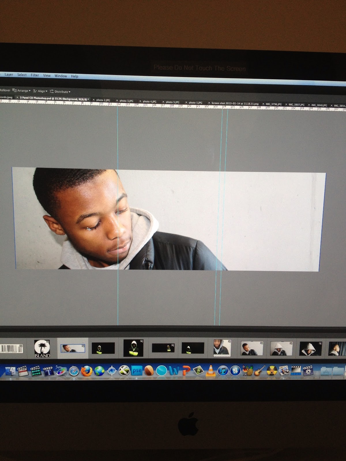
This shows the production aspect the inside panels of my digipak. Here I have stuck to the conventions of digipaks by using a medium close up shot of the artist as the album image, ensuring that the artist name and the album name are in the correct font size, including the essential information such as the copy right information, record label's logo and barcode and lastly the appropriate use of fonts and colours.

I have decided to keep the design of my digipak simple so that it clearly reflects aspects of the music video. I have not used any graphics, designs or colourful illustrations as that wouldn't establish a link with my music video. However, I have manipulated the images by changing the brightness and contrast to put emphasis on James' face. The images I chose to use on the front panels of mt digipak both show James looking outwards and away. This is to show how James' self reflectiveness and to mirror the message of the music video which is 'the impact of life'.

With the artist and album name, I realised that the writing of the font 'label impact' was transparent, as a result I have to put a white box underneath the text in order for it to show effectively. Also with the track listing, I initially used the font 'futura' however, it did not match with the rest of the font therefore, I decided to change it to 'label impact reverse' which works perfectly alongside 'label impact'.

After finishing the outside panels, I realised that the size of the track list was way too big and it looked unprofessional so I just changed the size of it so that it looks more appropriate. 

Production Ancillary - The inside of Digipak


Here is a screen shot of the inside of the digipak. I used the same grain filter on the images to match the front cover. I have the CD slot in the middle panel with the album name repeated in the centre. I kept it quite simple inside as I think the front of the digipak is very detailed and each panel has an image so I thought it the inside would look better with less images. The bottom bar on photoshop displays the images that I was planning on using. After trying different photos and the original one from my mock up, I decided this one would be most suitable as I could mirror it to get the impress that the artist is looking at the CD. 

Improvement On Ancillary